

Overview
Fora Therapy is a mobile allied health service provider with a distributed workforce of Allied Health Assistants (AHAs) and in-house Allied Health Professionals (AHPs), including speech pathologists, occupational therapists, and physiotherapists.
As Fora aims to convert graduating AHAs into full-time clinicians, they needed to better understand how to support graduates during their transition into their first professional role.
As a UX/UI Designer, I worked within a team to design a new graduate program that addresses the needs, expectations, and challenges faced by early-career clinicians.
My Role
Conducted user interviews and surveys
Performed competitor analysis
Synthesised research into key insights
Facilitated ideation workshops
Designed program structure and digital experience
Created UI designs and conducted usability testing
Understand the Problem
To understand the problem space, we conducted desktop research, surveys, and interviews with:
6 AHAs (target users)
4 AHPs (experienced clinicians)
While AHAs shared expectations and uncertainties, AHPs provided valuable retrospective insights into what support was truly impactful in their early careers.
Key Insights
Graduates want to learn quickly to build a strong foundation
They lack clarity around roles, expectations, and goals
They need ongoing clinical support and feedback
They feel unprepared for independent practice
They require both clinical and administrative training
They experience isolation due to mobile work environments
They prefer a gradual transition into full caseloads
Define the problem
Synthesising these insights revealed four major pain points
Major pain points
Lack of Clinical Support & Feedback

New graduates feel they don’t receive the level of clinical support they would like in terms of 1:1 mentoring, supervision, case reviews & feedback from senior clinicians.

Lack of structure & clear expectations
New graduates feel frustrated with the lack of structure in their first job and are uncertain about their role & the goals they need to achieve.
Feeling unprepared for independent work

New graduates don’t feel adequately prepared or trained to provide services end to end (i.e. paperwork, processes, clinical knowledge, scheduling) when they see clients independently.
Loneliness & Isolation in a mobile clinic

Due to the nature of a mobile clinic, new graduates feel isolated and lack connection with the team.
Problem Statement
Newly graduated clinicians feel inexperienced and anxious transitioning into their first full-time role and need structured support, accessible information, and guidance from experienced professionals
Design Approach
I held an ideation session with 6 new graduates focusing on 2 key How Might Wes (HMWs):
How might we create a supportive experience for graduates?
How might we help make sure graduates feel confident and prepared for their first solo client session?
Based on the ideas generated & voted on by new graduates, we decided to design a 12 month graduate program.
We plotted all the potential features on a Minimum Viable Product (MVP) matrix and focused on the Quick wins, which could generate high impact and require low effort.

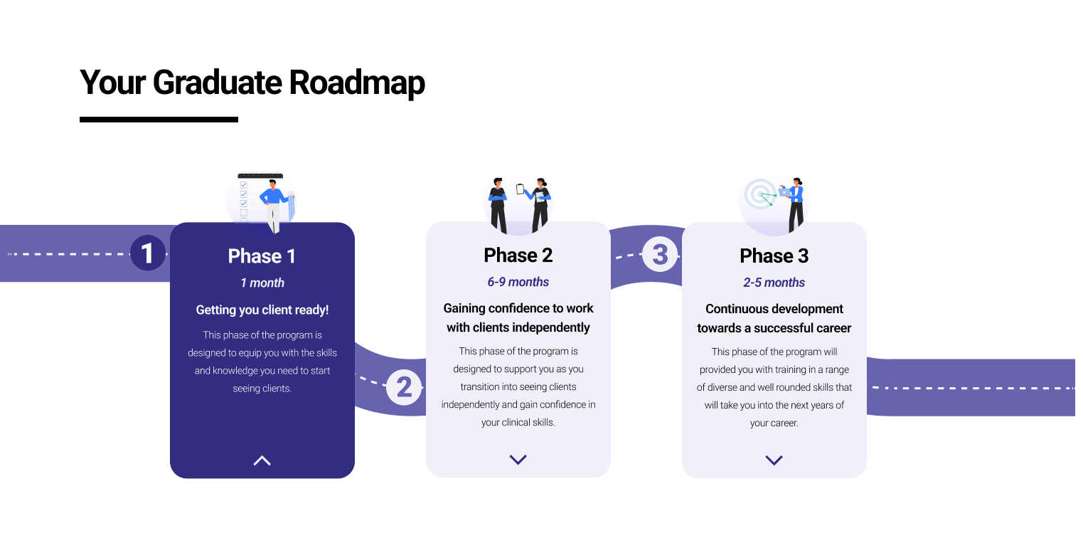
The Graduate Program
1. Designing a structured program journey
I translated the graduate experience into a clear, end-to-end journey spanning the first year of employment.
The program was structured into 3 phases:
Training & Preparation (1 month ) ;
Supported Practice (6-9 months ) ;
Career Development (2-5 months
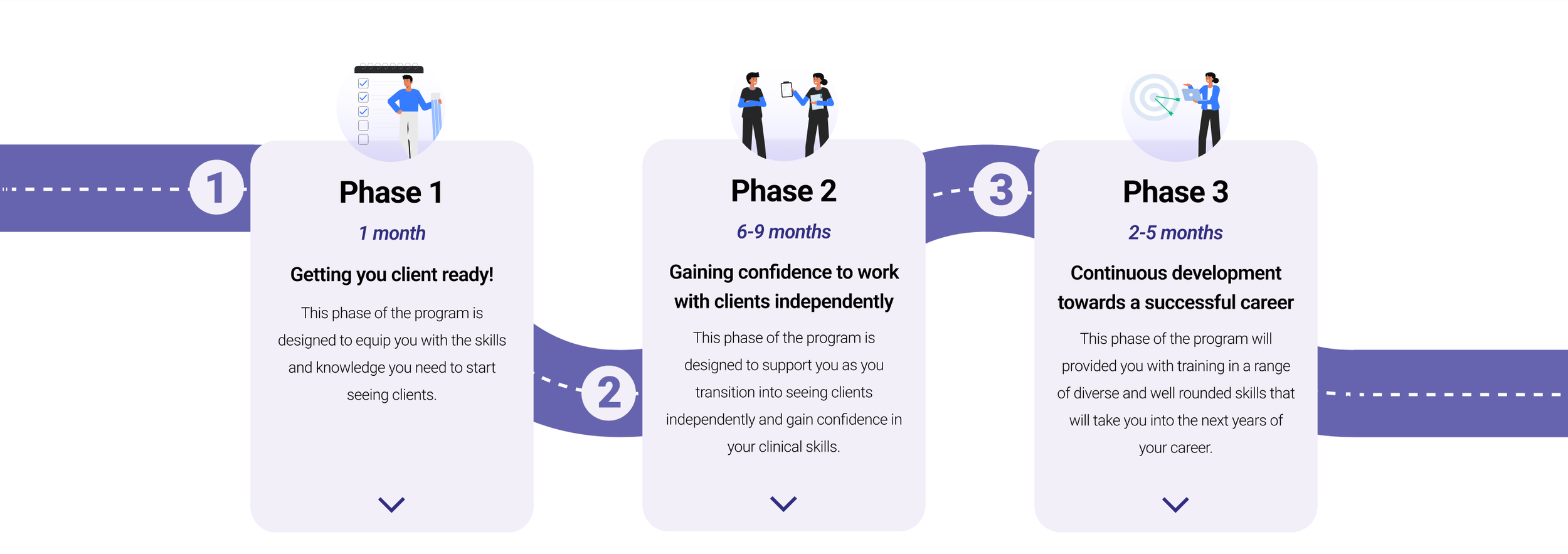
This will provide graduates with clarity on expectations, progression, and what success looks like at each stage.
2.Prioritising High-Impact Features
Through ideation workshops and MVP prioritisation, I focused on features that would deliver the highest value with minimal complexity.
Concept testing with 7 graduates validated that the most important elements were:
Discipline-specific clinical training
Structured program manual
Opportunities to work on relevant cases
Lower-priority features were intentionally excluded to maintain focus and feasibility.
3. Embedding Support into the Experience
To address the lack of clinical guidance, I incorporated structured support mechanisms such as mentoring, supervision, and training workshops throughout the program.
This will ensure graduates receive continuous feedback and feel supported as they develope their skills.
4. Designing for Connection in a Distributed Team
To combat isolation, I introduced recurring touchpoints such as cohort meet-ups, social sessions, and wellbeing initiatives.
These moments were designed to foster a sense of belonging and strengthen team connection despite the mobile nature of the work.
Validation & Iteration
To ensure the program met real user needs, I conducted both concept testing and usability testing with graduates.
Concept testing helped prioritise features based on perceived value, allowing us to focus on what mattered most early in the process.
I then conducted two rounds of usability testing with 6 graduates to evaluate the clarity, structure, and usability of the program and its digital touchpoints.
Participants responded positively to the structured approach and emphasis on training:
“The structure is really clear. Lots of support around training and workshops are really good.”
“I love the fact it has a structured manual and workshops. Training workshops are huge.”
These insights informed iterative improvements to content, program flow, and layout.
UI Design & Iteration
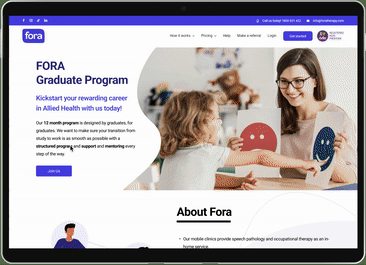
I designed a landing page to communicate the graduate program and capture sign-ups.
During testing, I identified that key interactive elements—such as the program roadmap—were not intuitive.
To address this, I refined the design by:
Introducing clearer affordances (arrows, visual states)
Improving visual hierarchy
Enhancing interaction cues
Subsequent testing showed significant improvements in engagement and usability.
The final design also meets WCAG 2.1 AA accessibility standards, ensuring readability and inclusivity.

Before
After
Final product
The final graduate program combines a structured experience with a clear and engaging digital interface.
Clean & Easy to scan
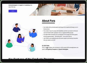
The landing page is divided into various sections to introduce the company, key features & stages of the program, the team and frequently asked questions.
Clear structure & Detailed info
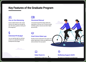
The landing page highlights the key features of the program and three main stages, with detailed information of each stage.
Simple form to collect leads
A simple form to collect possible leads, with cheerful animations to indicate successful registration.
Reflections
Test early and often — Concept testing helped prioritise high-impact features and avoid wasted effort
Balance ambition with feasibility — MVP thinking prevented feature creep and kept the project focused
Design beyond the interface — Structuring the experience itself created the most meaningful impact